
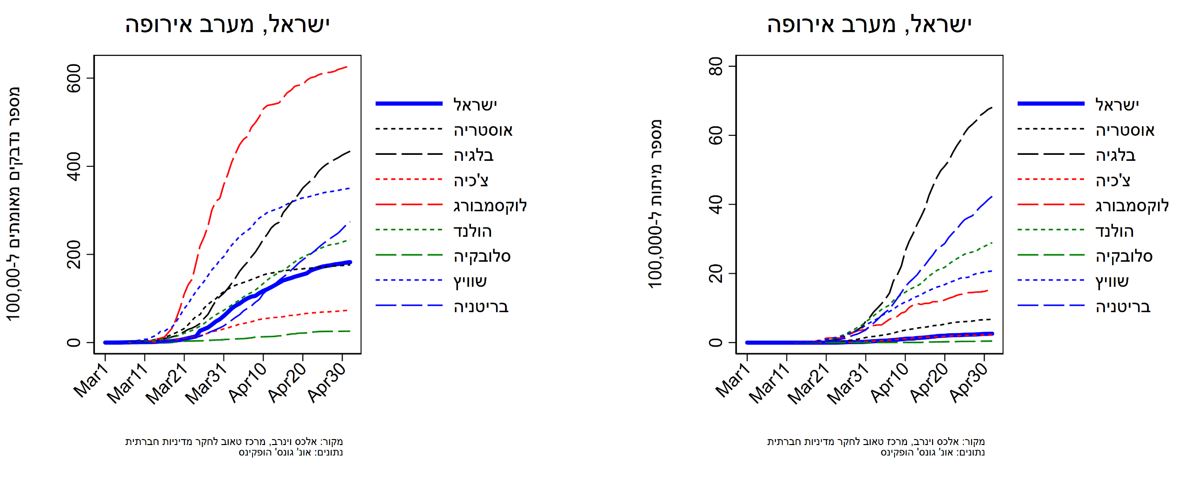
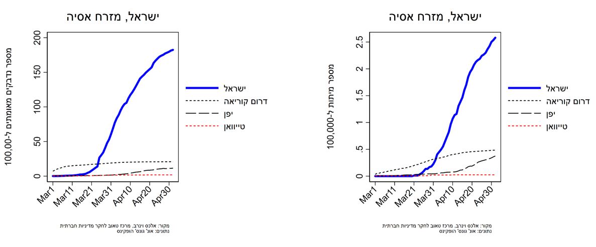
בעמוד זה תמצאו תרשימים בעדכון יומי (עדכון אחרון: 5.5.2020) שמציגים את שיעור הנדבקים בקורונה (כלומר מספר הנדבקים לכל 100,000 נפש) ואת שיעורי התמותה מקורונה (מספר מקרי המוות לכל 100,000 נפש) ב-36 מדינות OECD ובטייוואן.
אני מצליב את נתוני הקורונה, שנלקחו ממרכז CESS שבאוניברסיטת ג'ונס הופקינס, עם הערכות גודל האוכלוסייה של האו"ם מ-2019. התרשימים מחולקים לפי אזורים ב-OECD. בצד שמאל מוצג מספר הנדבקים ל-100,000 נפש ובצד ימין מספר מקרי המוות ל-100,000 נפש (שימו לב לשוני בצירי ה-Y בין שני התרשימים).
מנקודת מבט ישראלית המסקנה הכללית מההשוואות האלה ברורה למדי. שיעור ההדבקה ל-100,000 נפש בישראל קרוב יחסית לממוצע במדינות דרום ומערב אירופה, אך גבוה יותר מכמעט כל מדינות סקנדינביה ומדינות מזרח אירופה. באירופה, שיעור ההדבקה הדומה ביותר לזה של ישראל הוא בגרמניה (בפער של 3–4 ימים). מחוץ לאירופה, המגמה הייתה זהה לזו של ארצות הברית מאז אמצע חודש מרץ עד תחילת אפריל, ועלתה על זו של מדינות דוברות אנגלית אחרות (קנדה, אוסטרליה, ניו זילנד) וגם על זו של מדינות מזרח אסיה שמשתייכות ל-OECD. העלייה הזו אינה הכיוון אליו אנו שואפים. כפי שאנחנו מראים במקום אחר, למרות שהעלייה בשיעור הנדבקים התייצבה בטווח של 3-4% במהלך חג פסח, בשלושה הימים האחרונים חלה ירידה משמעותית ל-2% בלבד.
החדשות הטובות יותר מבחינת ישראל הן במספר מקרי המוות לכל 100,000 נפש. מספר זה עומד בישראל על פחות מ-10% ממספר המתים לנפש בהולנד, בלגיה, שוויץ ובריטניה, ועל פחות ממ-20% מבארצות הברית, בריטניה ושוודיה. אפילו בגרמניה, שמסתמנת כאחת המדינות שמתמודדות עם המגפה בצורה הטובה ביותר, מספר המתים ל-100,000 נפש עומד על יותר מפי שניים מאשר בישראל. אנו דנים באחד הגורמים העיקריים לכך במקום אחר.
ישראל ומדינות ה-OECD באירופה


ישראל ומדינות OECD לא אירופאיות

מחבר/ת

פוסטים אחרונים
בינואר שני תינוקות מתו במעון לא מפוקח, אבל כמה פעוטות נמצאים ללא פיקוח בישראל?
18.05.2026ב-19 בינואר 2026, מתו שני תינוקות בני 3 חודשים וחצי שנה במעון לא מפוקח בירושלים. החשד הוא שהם מתו מהתייבשות
- דנה וקנין גנאל
סגירת מוסדות חינוך בישראל: הגיעה השעה לקבוע מנגנון פיצוי מובנה
16.03.2026מאז מרץ 2020 נסגרו מוסדות החינוך בישראל סגירה לאומית מלאה שש פעמים: בשלושה סגרי קורונה ובשלוש מערכות לחימה. עד כה
- שרית סילברמן
כיצד מממנים את מחזור החיים במדינת ישראל?
03.11.2025- אלכס וינרב , קיריל שרברמן , אבי וייס
המחסור ביוד באוכלוסייה בישראל ועידוד השימוש במלח מועשר ביוד
24.08.2025צוות היוזמה למחקר ומדיניות סביבה ובריאות של מרכז טאוב שלח ליו"ר ועדת הבריאות של הכנסת נייר מדיניות בנושא המחסור ביוד